CERN Landing Page
A Landing Page constitutes a content type that provides standalone pages to add in your Drupal site in order to provide a nice way to present and advertise your page and content.
Landing Pages consist of building blocks, which can be web components, views, or blocks.
Regardless of type (i.e. component / view / block), Landing Pages are are always encapsulated in Section wrappers.
The below screenshot shows an example of a Landing Page.
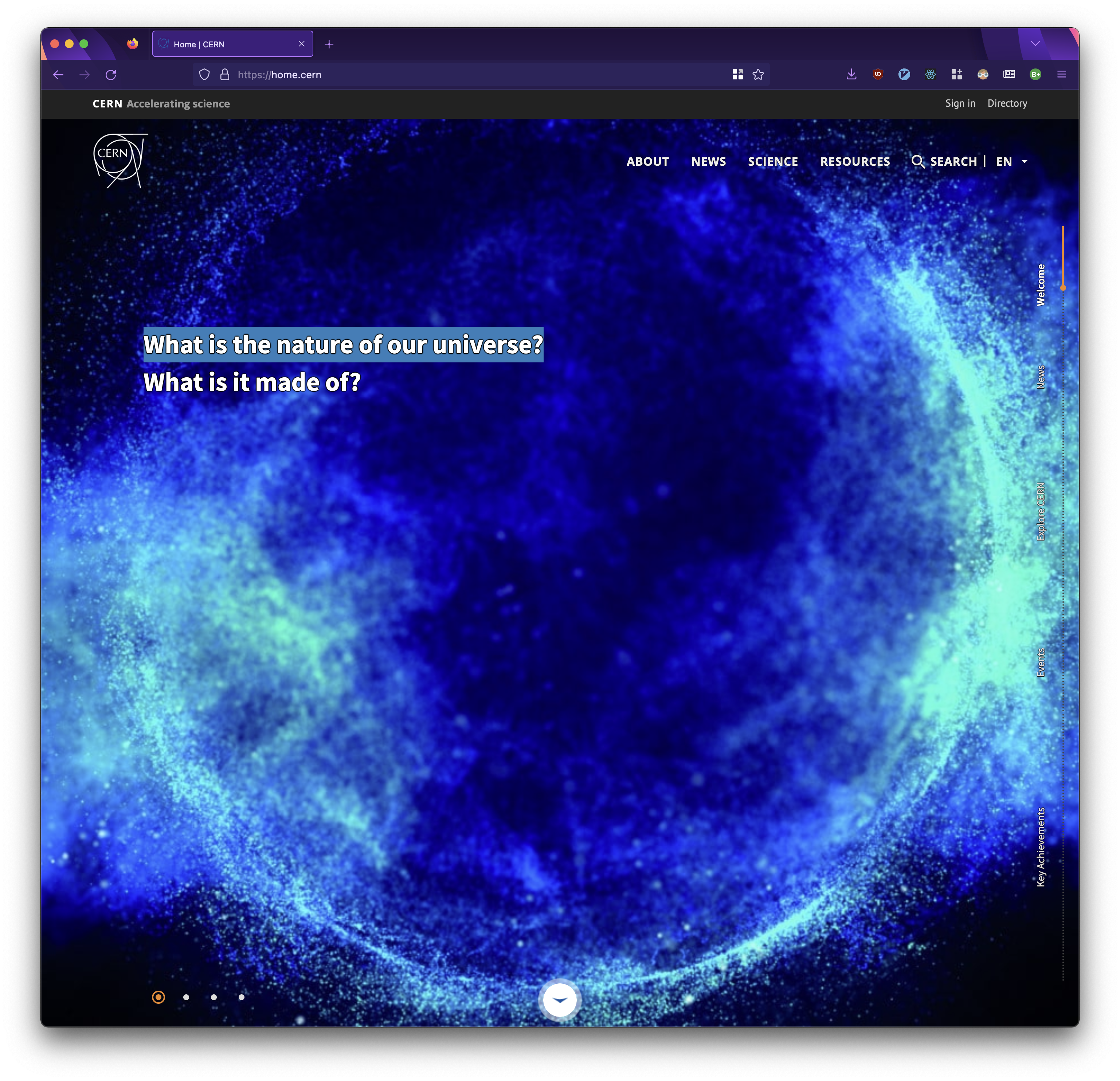
The home.cern website.
In order to enable Landing Page content type, you have to enable the CERN Landing Page module.
This comes pre-installed and pre-enabled by default when using the CERN Drupal Distribution.
Importantly, Landing Pages are Drupal nodes like other types of content.
As a result, a landing page can be created by navigating to Content > Add Content > Landing Page.
The Landing Page contains the following elements:
Section Wrapper
All web components are encapsulated inside sets divisions called Sections.
The following image presents the concept of section in a more visual way.
More specifically, each red frame of the screenshot indicates one section.
Sections are useful to configure settings for the content inside.
For example, some typical settings can be the height of the section, the width of the section, or whether you want to apply parallax effects while scrolling the section.
The paragraphs below explain all the settings in details.
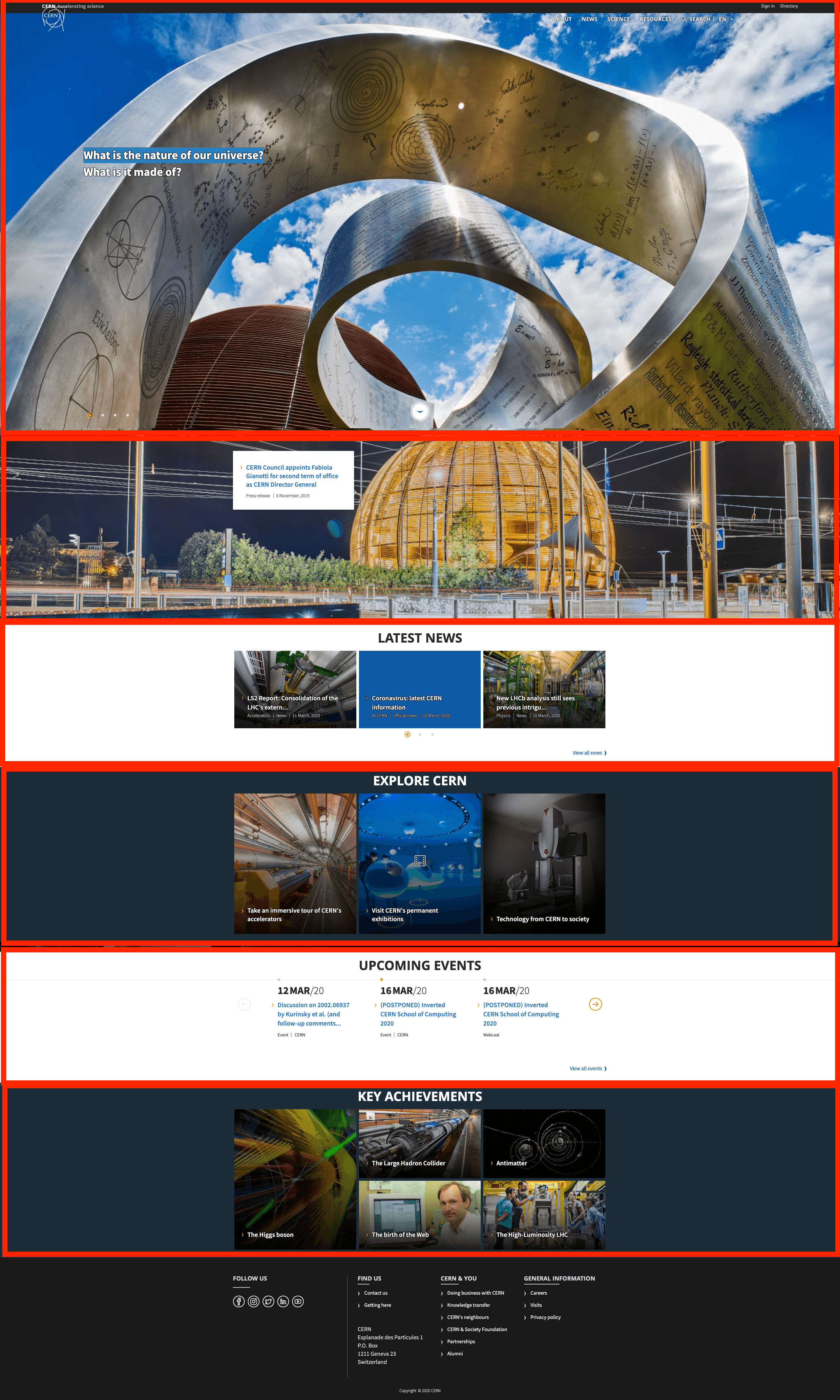
Landing Page section wrappers on home.cern.
Basic Settings
Each section has the following, configurable settings:
| Setting | Description |
|---|---|
| Has header? | This option is meant to be used with the Hero Header component. More specifically, when this option is checked, the menu is displayed on the Hero Header instead of above the Hero Header. |
| Title/ Title color/ Show title | The title of the section along with settings regarding its color and whether you want it to be rendered or not. |
| Scrolling Menu Title / Show Scrolling Menu Title | This is meant to be used withthe Scrolling Menu component. More specifically, in this setting you canset the title that you want this section to have on the Scrolling Menu and whether you want it be rendered it or not. |
| Display | This setting sets the width of the Section: Centered Content: The content and the background of the section are centered. Fluid width: The content and the background of the section cover the full width of the page. Fluid BG Center content: The background of the section covers the full width of the page but the content is centered. |
| Section height | This setting sets the height of the Section: -None-: In this case, the section will cover as much content as necessary for the content to be displayed. Half Height: The Section forcely covers half of the viewport. Full Height: The Section forcely covers the whole viewport. |
| Effects | This setting provides a set of effects for the sections, mostly related to the parallax scrolling effect. Background parallax: While scrolling, the section will move behind the next section. Cover parallax: While scrolling, the section will cover the next section. Cover parallax video compatible: The same as cover parallax, but includes compatibility for CDS videos. Background rotation: while scrolling the background will be rotating. |
| Lazy Section | This setting makes the section appear while scrolling |
| Box effects | This setting is meant to be used for the 4 box elements: Article Box, Thumbnail Box, Resource Box and Agenda Box. More specifically, it provides an effect that expands each box when hovering. In order to be used, all the components inside this section need to be of box type. |
Background Settings
Any section can have a background. This background can be an image, a video, or a colour. In the cases of images and videos, they can be either local resources that you upload from your machine or CDS resources. If you are choosing an image, be mindful of the size of the image as this would need to be loaded by end-users.
Content
The main content of Landing Pages constitute of Web Components. A dedicated page presents the list of available components. The content can be placed in any of the three columns: Left, Center or Right. Based on where you will place your content, the columns will cover specific amount of the section.
The percentage of page that each column will cover depends on which display you have chosen, e.g. centered content, fluid width etc..
The following table shows the section coverage based on which columns you have chosen:
| Setting | Description |
|---|---|
| Only left column | The content of the left column will cover 50% of the section. |
| Only right column | The content of the right column will cover 50% of the section. |
| Only left and right column (without center column) | The content of the left column will cover 50% of the section while the content of the right column will cover the rest 50% of the section. |
| Only center column | The content of the center column will cover 100% of the section. |
| Left & center column | The content of the left column will cover 25% while the content of the center column will cover the rest 75% of the section. |
| Center & right column | The content of the center column will cover 75% of the section while the right column will cover the rest 25% of the section. |
| Left, Center & right column | The content of the left column will cover 25% of the section, the content of the center column will cover 50% of the section and the content of the right column will cover the rest 25% of the section |
Web Components
The following web components are available:
Hero Header
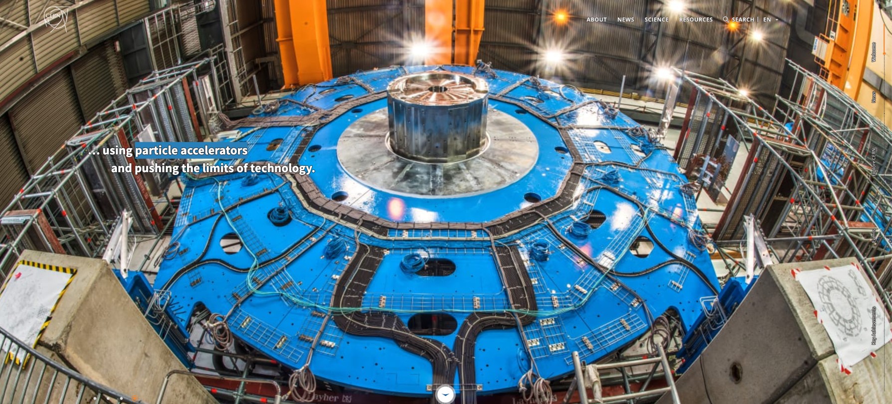
An example of a Hero Header.
A hero component mostly used as the first component in order to introduce the reader to the topic of your page. You can add multiple frames with different backgrounds and text in order to look like a slideshow.
Usage Tips:
- Use it as the first component in your Landing Page.
- Use it in a section with either Full Height or Half Height.
- Use it with Full Width.
- Very useful to use it with Has Header setting since it looks nice when the main menu appears on top of the Hero Image.
Featured Banner
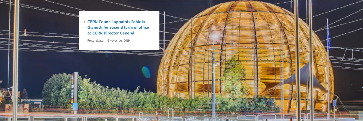
An example of a Featured Banner.
Informative component used in order to provide more information regarding a section. Each Featured Banner can have a background image, a link and a box with information.
Usage Tips:
- For better look n feel, use it in a section of Fluid Width display.
- You have the option to either use a CDS image or upload an image from your machine.
- The box can be placed in 4 different positions: Top Left, Top Right, Bottom Left or Bottom Right.
Featured Quote
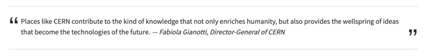
An example of a Featured Quote.
Presents a quote along with the name of the person who mentioned it.
Usage Tips:
- For better look n feel add it in a section of Centered Content display.
Image Gallery
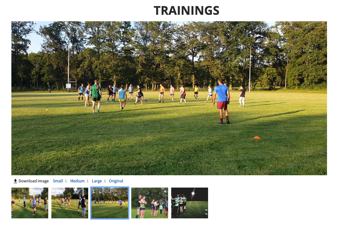
An example of an Image Gallery.
A gallery component presenting images either local ones or from CDS. Each image has a download button for different sizes.
Usage Tips:
- You can add either local images (uploaded from your computer) or CDS images.
- CDS images pull fields automatically from CDS, including caption.
- Local images do not support caption.
Text Component
Adds formatted text in a section in order to write paragraphs.
Usage Tips:
- You can use Text Component with Lazy Section to make the text appear while scrolling.
- For a better experience you are advised to use the CERN Full HTML text format. The format provides out-of-the-box text styles.
Box Shapes
Boxes feature three types of displays:
- Portrait: The box has a vertical orientation. [red-bordered box in the image below]
- Simple: The box has a small parallelogram shape [green-bordered boxes in the image below]
- Landscape: The box has a horizontal orientation [blue-bordered boxes in the image below]
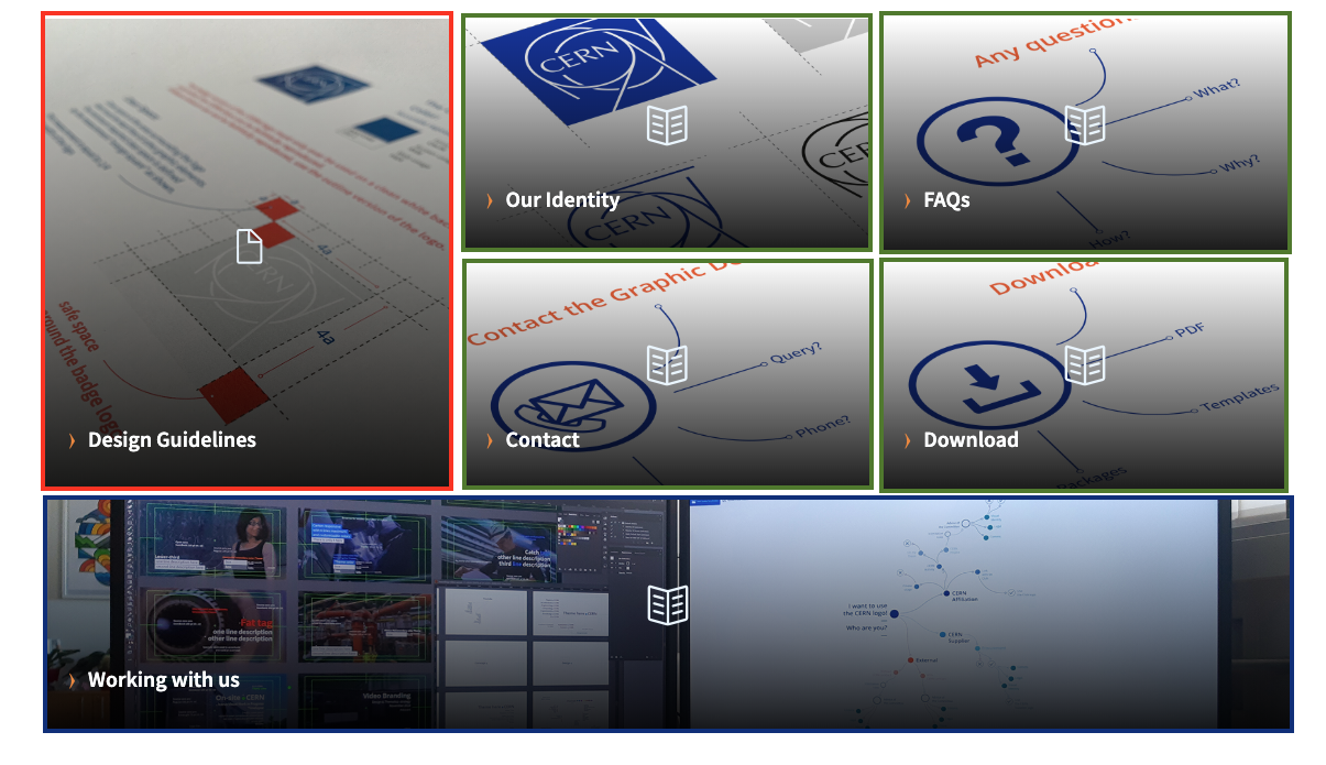
The types of displays for boxes.
- Display: Portrait [red box]
- Display: Simple [green box]
- Display: Simple [green box]
- Display: Simple [green box]
- Display: Simple [green box]
- Display: Landscape [blue box]
In general, if you start the section with a portrait and then place four simple boxes one after the other, you will have the format with the red and green boxes as seen in the above screenshot. Other layouts are also possible, e.g. three portraits in a row, or three simple boxes in a row.